Sovata
Rebrand

There is only one Sovata!

Sovata is the most famous resort town in Transylvania, a strong urban and tourist brand. It is a natural wonder, a home to many experiences. The town, the town hall and its tourism institutions needed a coherent, but flexible and modern identity that would reflect all this diversity and uniqueness. A particular challenge was that both Sovata as a town and Sovata as a resort have a strong character, but the two are often perceived as separate entities rather than as part of a whole.
SERVICES PROVIDED

Brand Strategy
Visual Identity
Logo design
Identity Guidelines
Digital Design
Graphic Design
Print Design

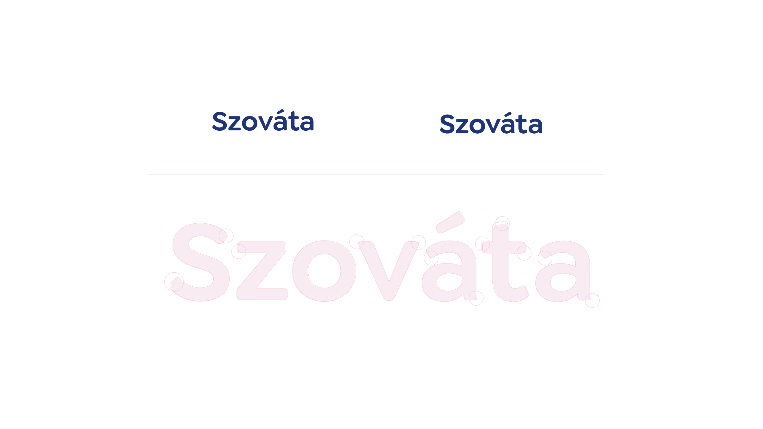
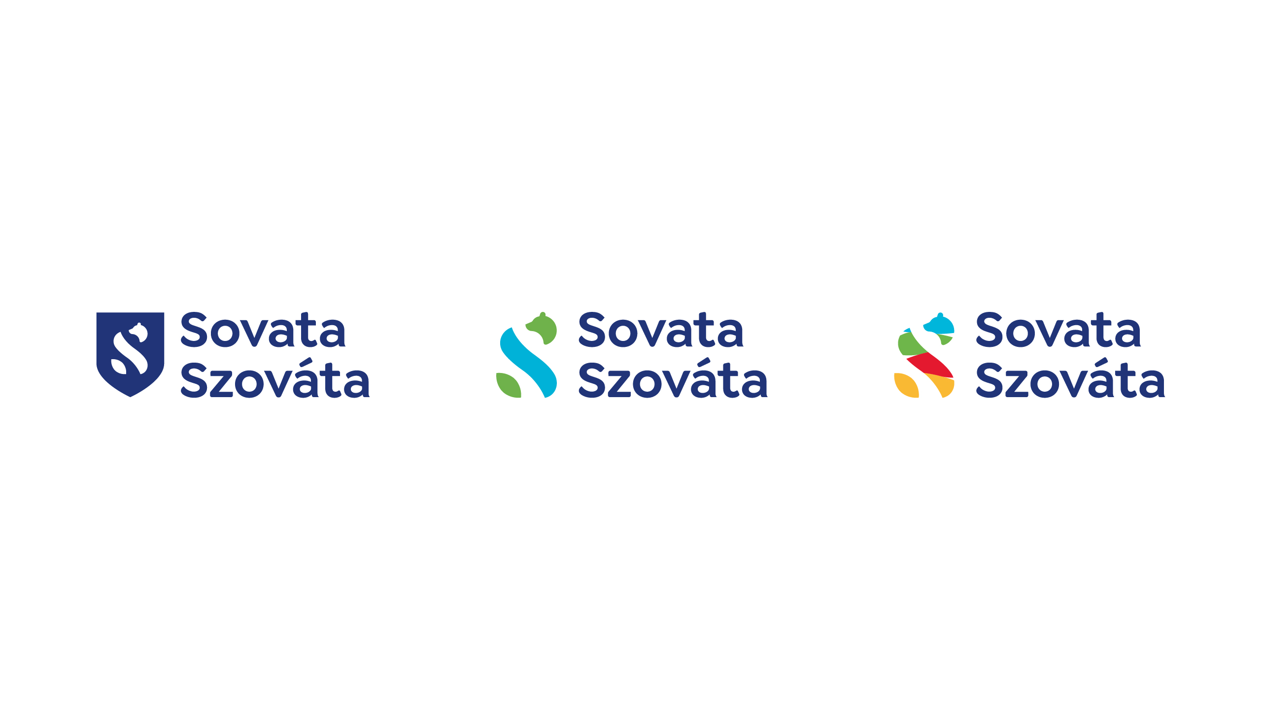
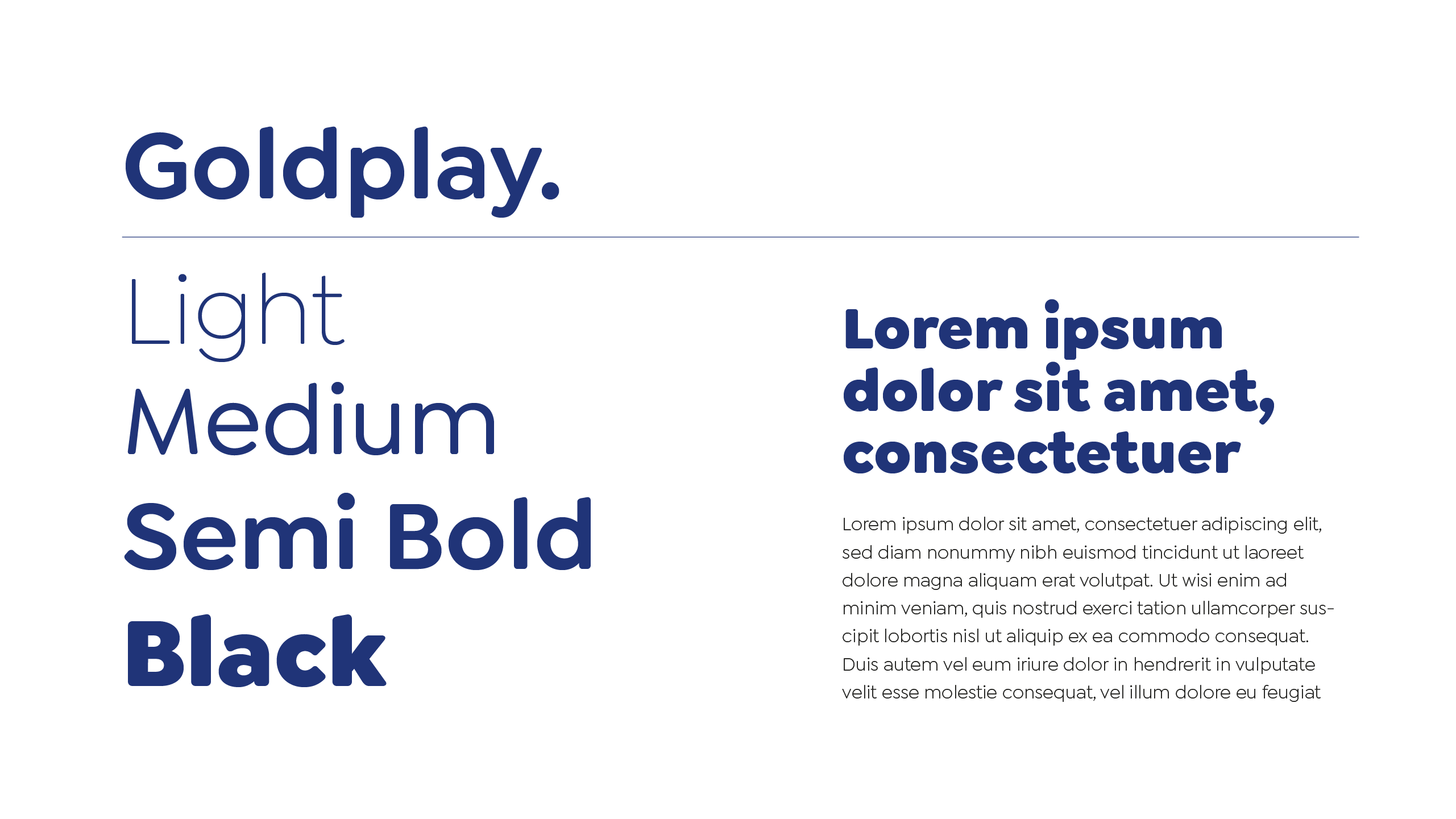
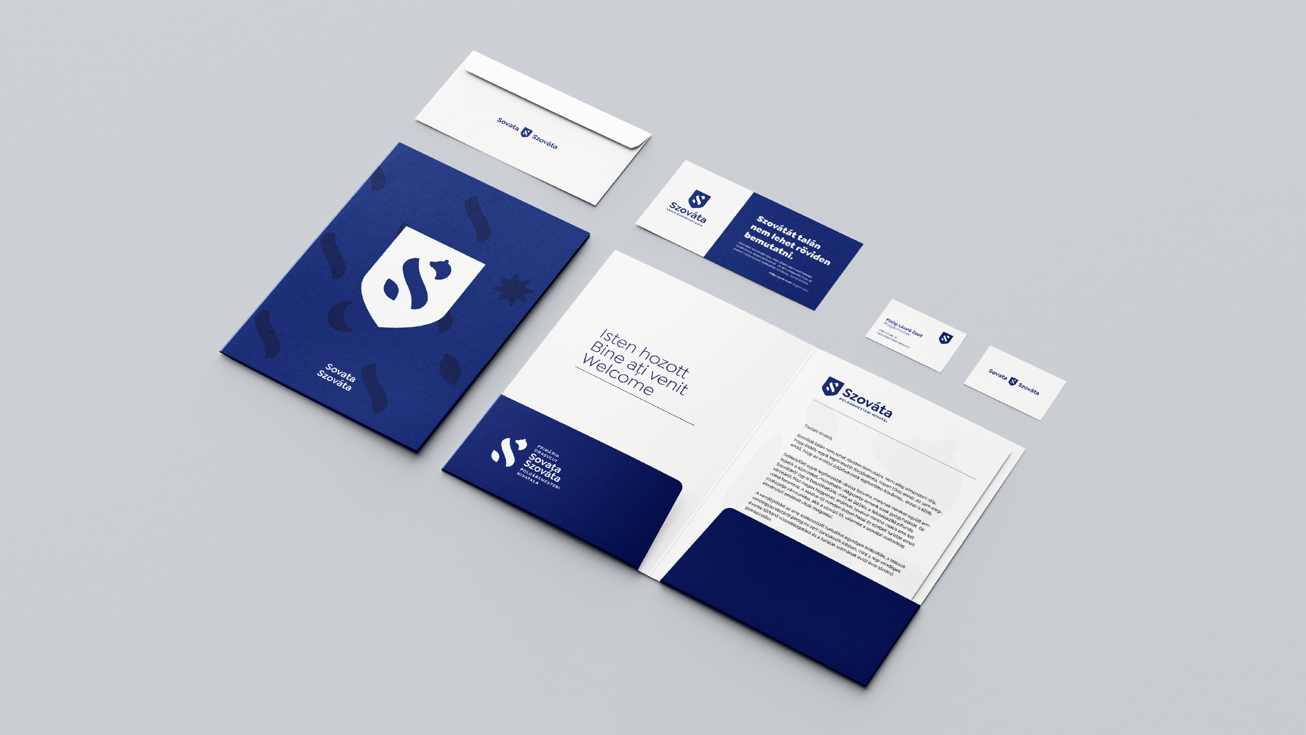
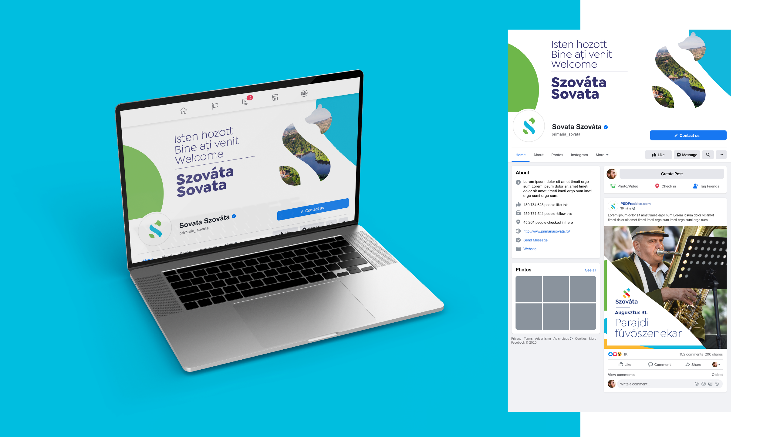
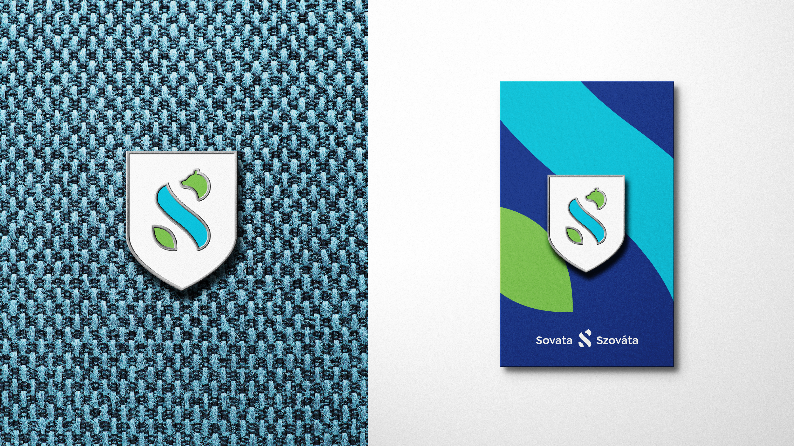
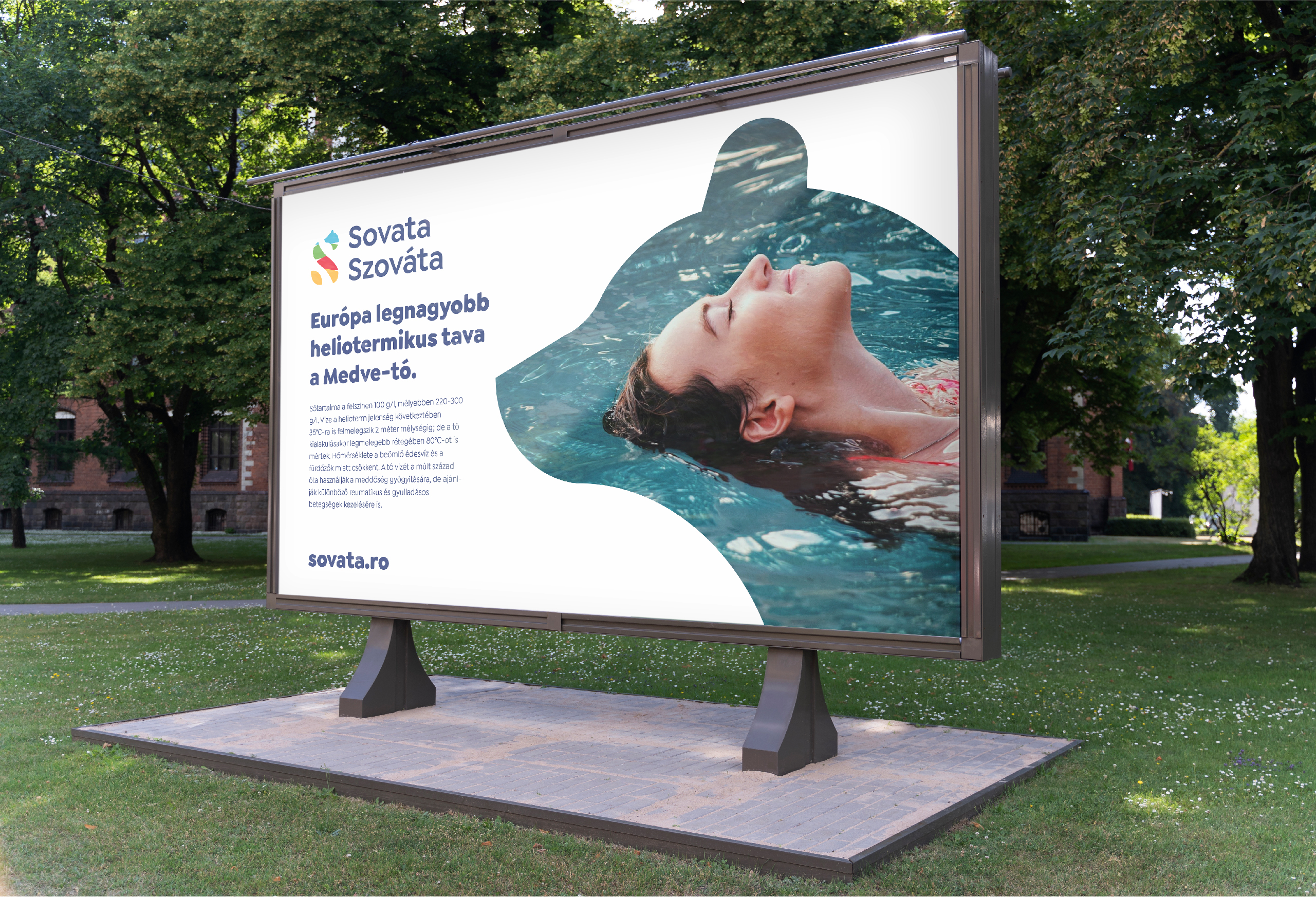
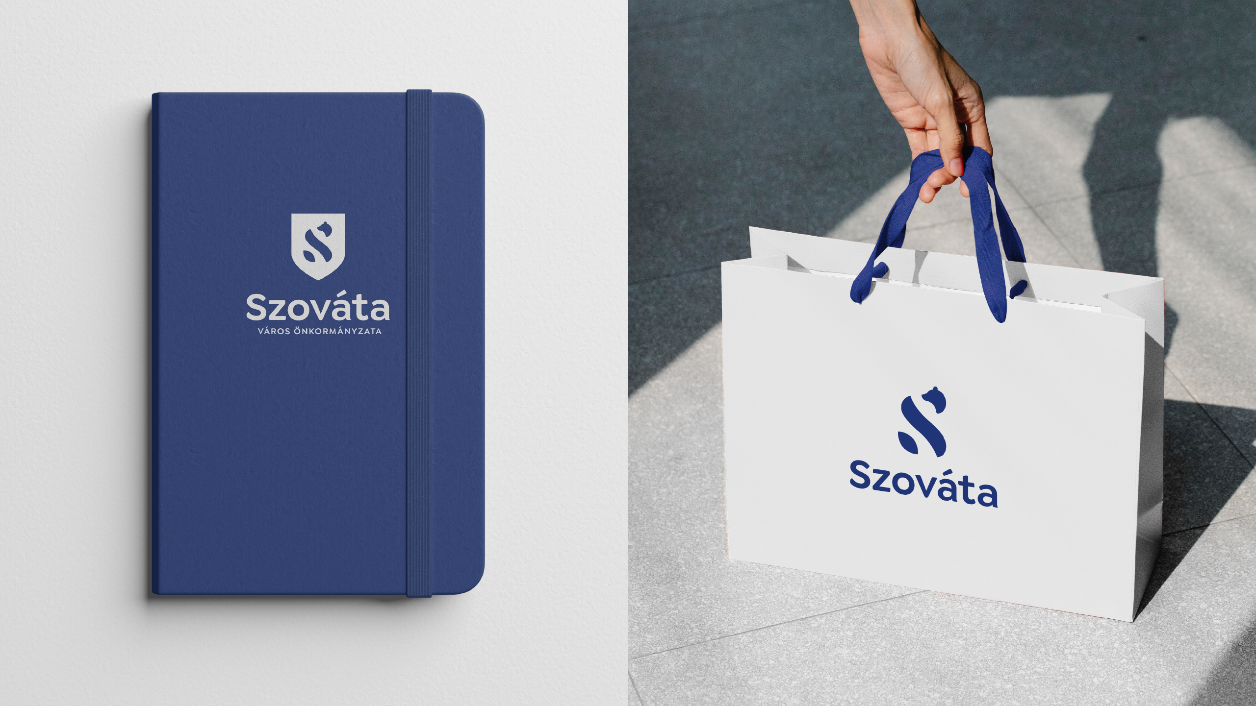
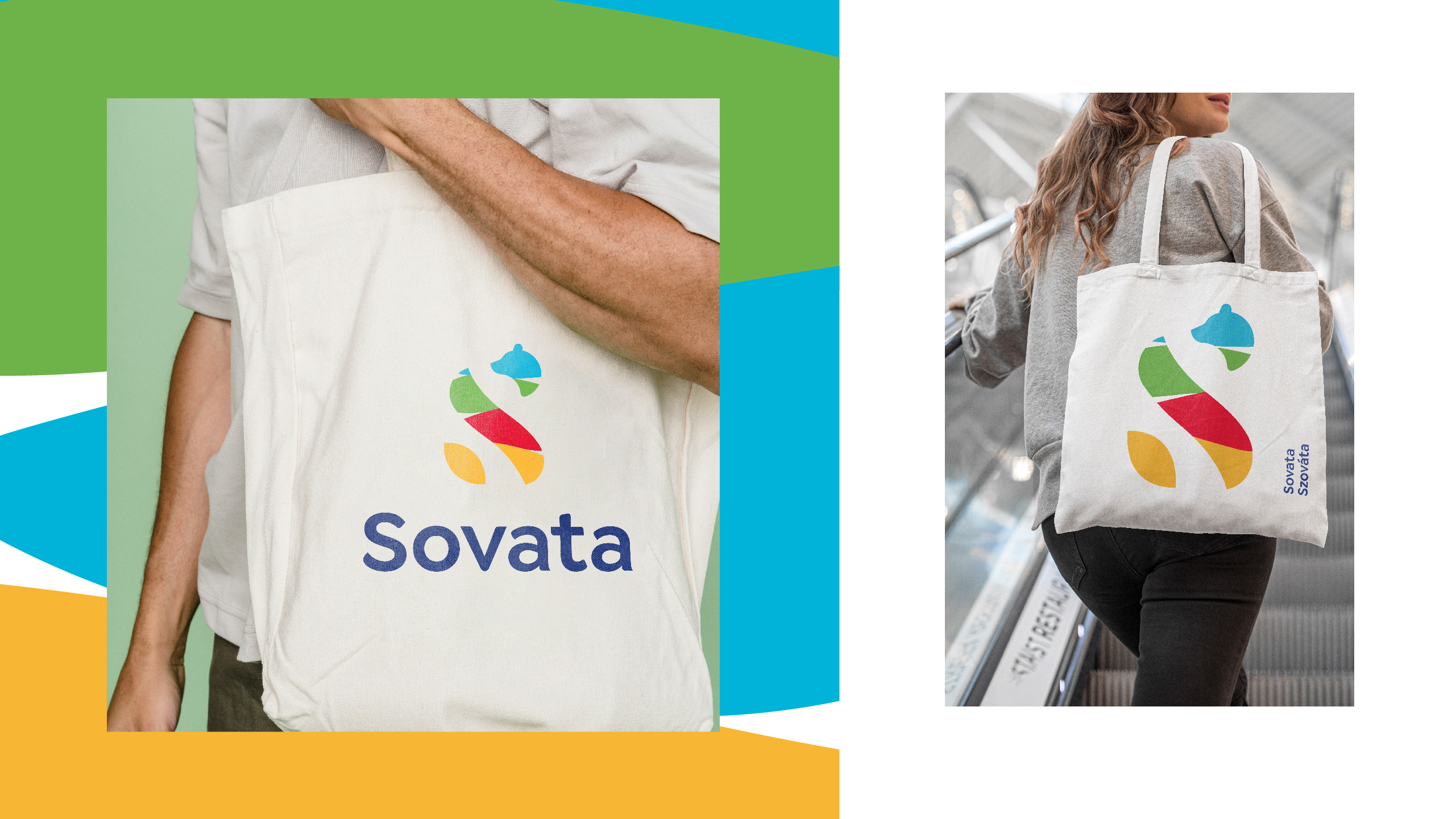
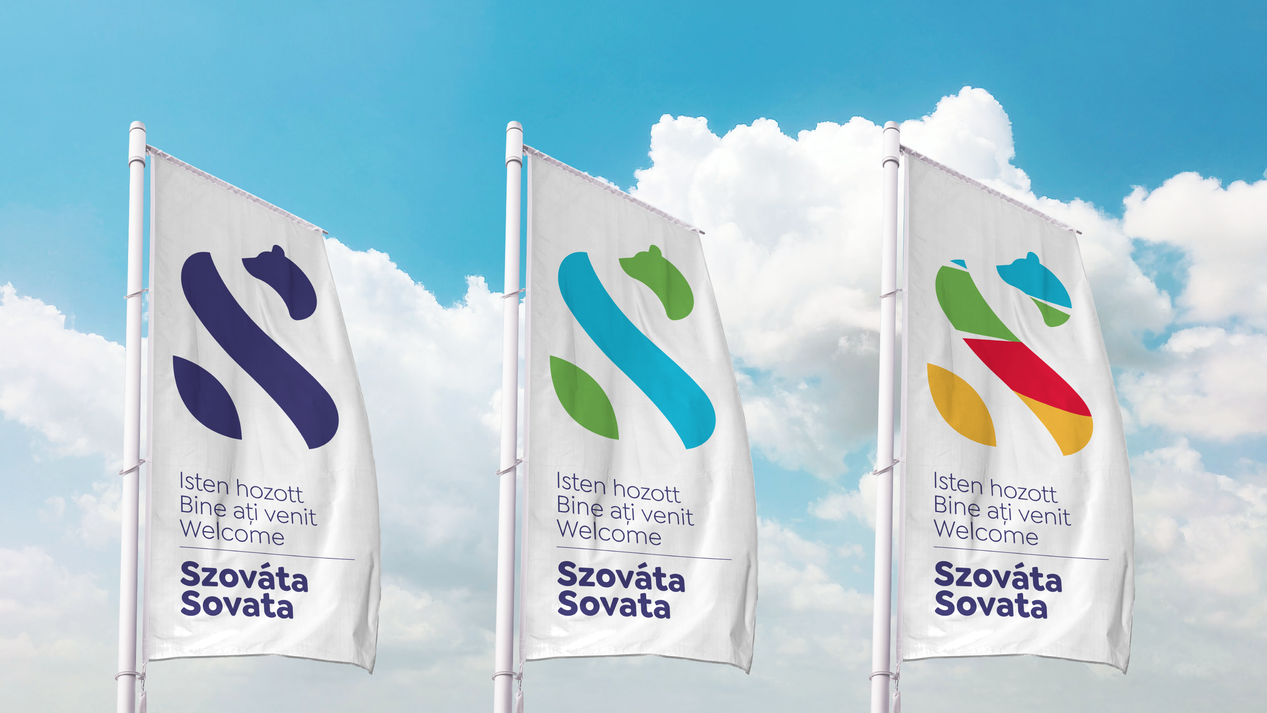
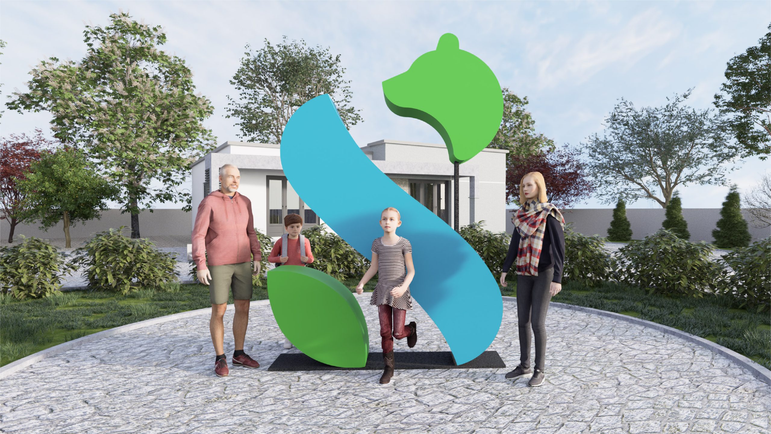
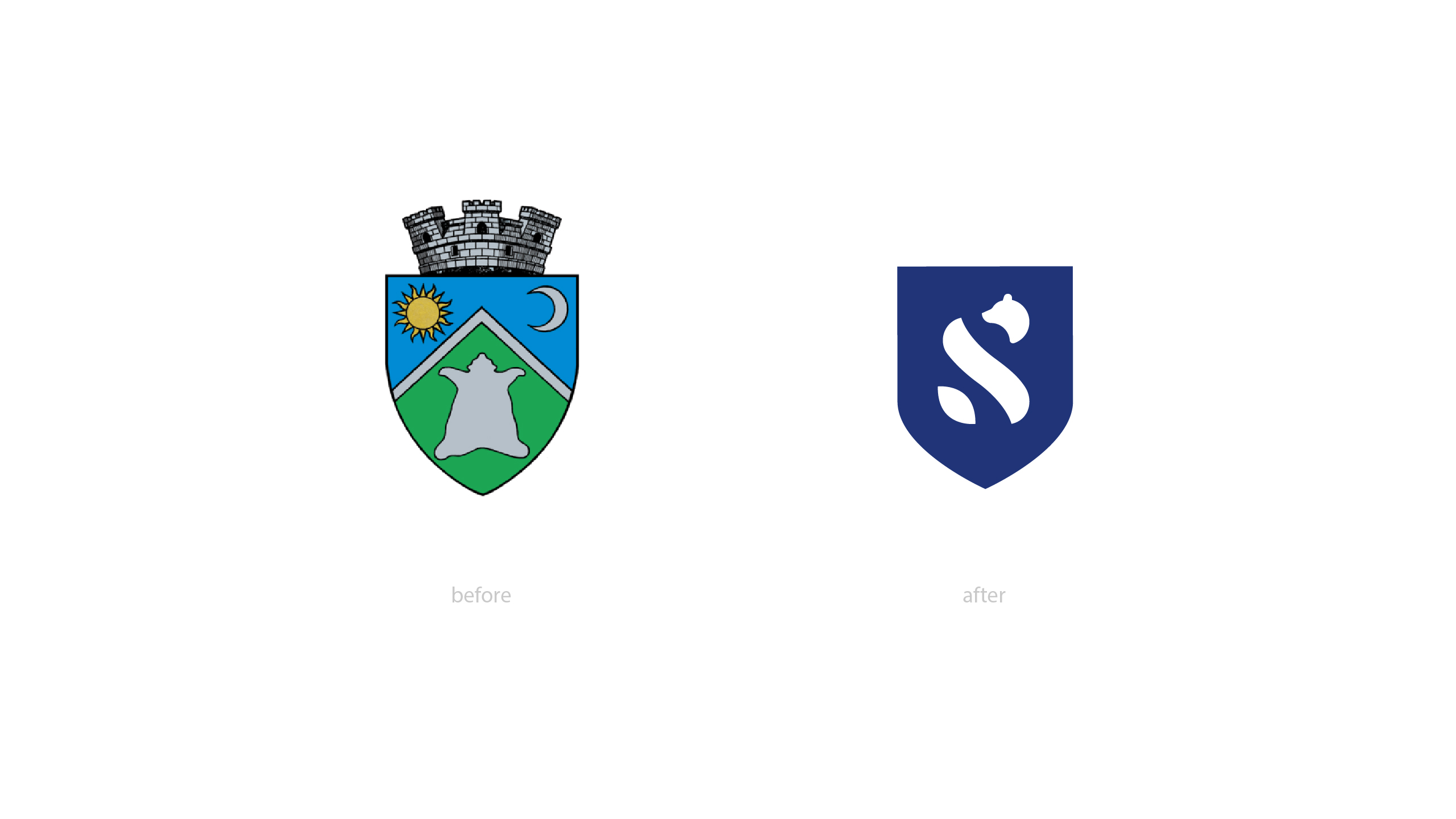
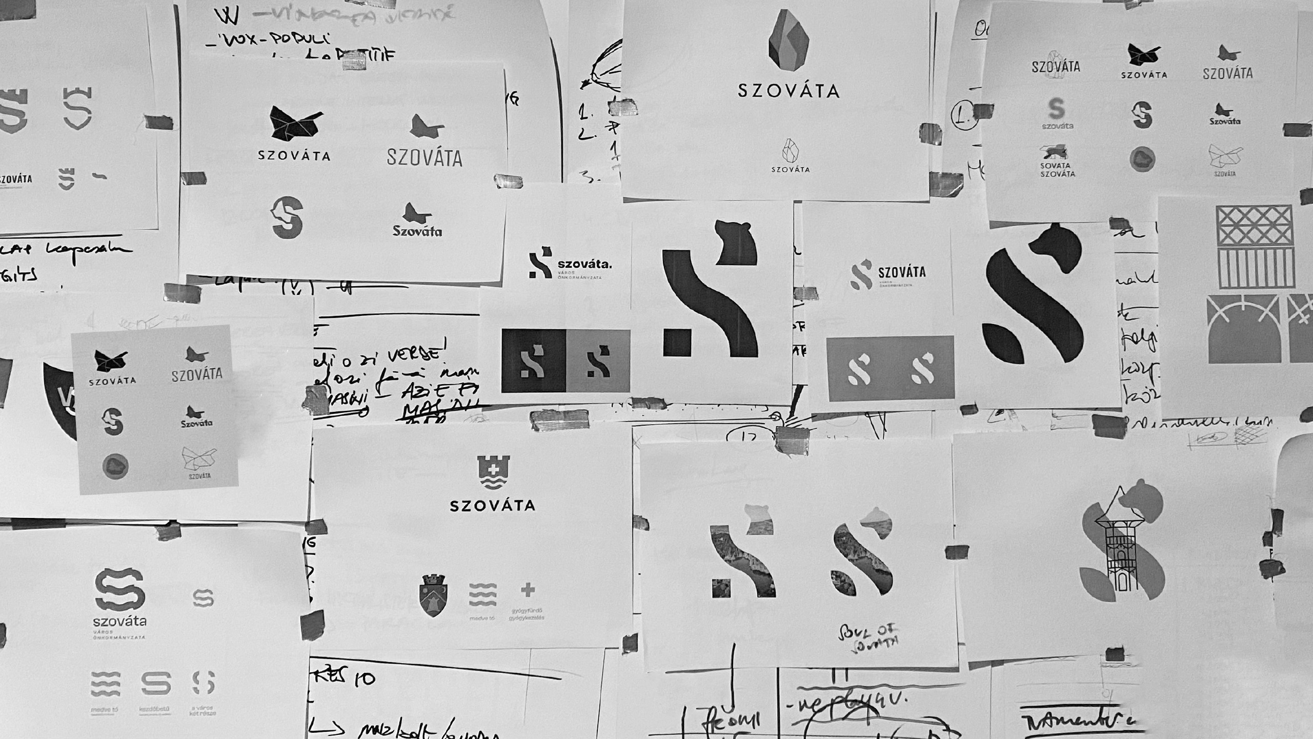
We have created a unique visual identity that celebrates the traditional values, culture, community, tourism and vision of Sovata. Building on the brand idea of “There is only one Sovata!”, we reinforced the uniqueness and unity of the town with the new visual identity, which is also a toolkit, including a new logo, typography, complementary identity elements and a three-colour scheme. The unique symbol is based on the initial letter of the town’s name, the S symbol, and is linked to one of the town’s most prominent tourist attractions, Europe’s largest heliothermal lake, Lake Bear.

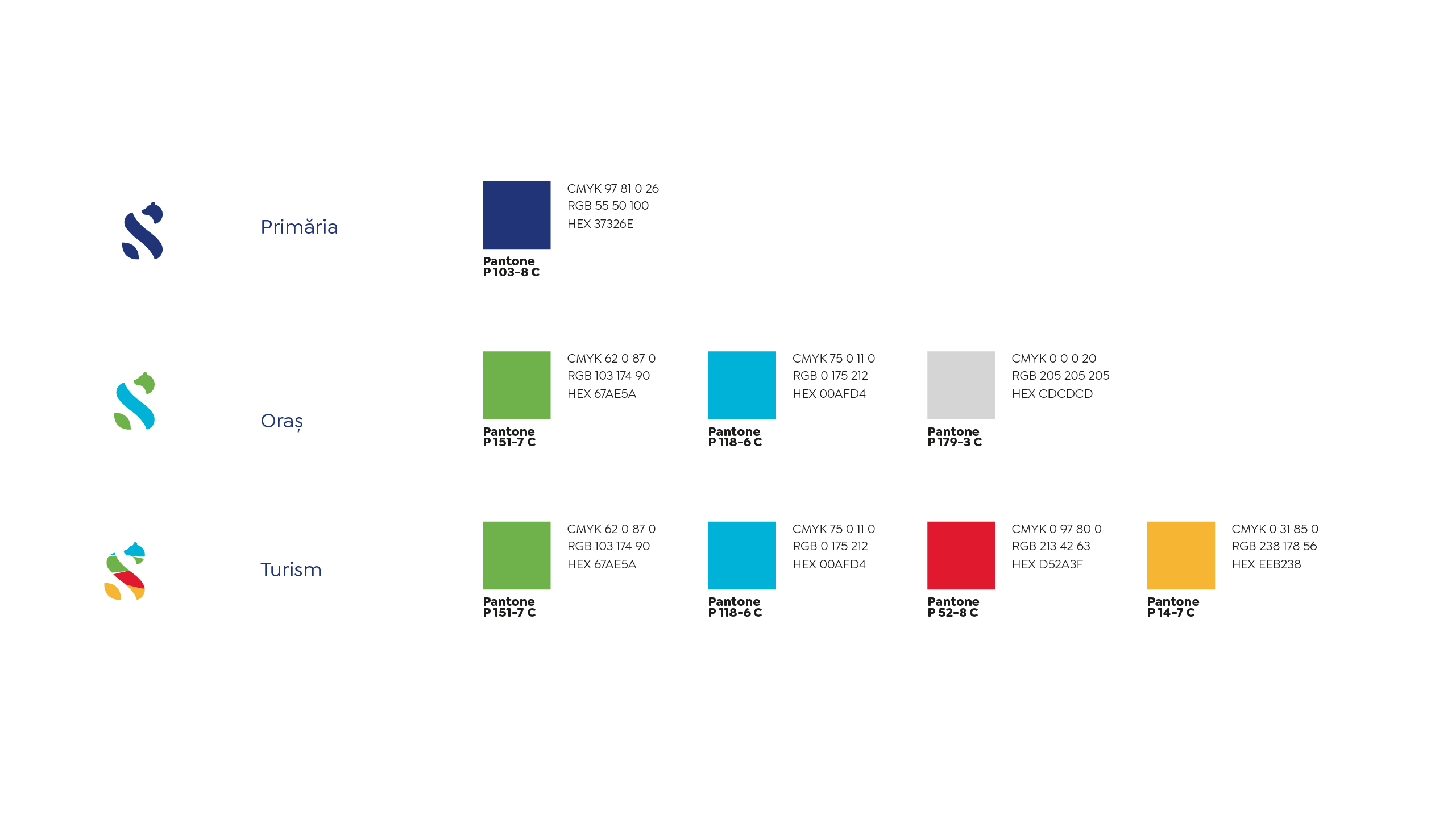
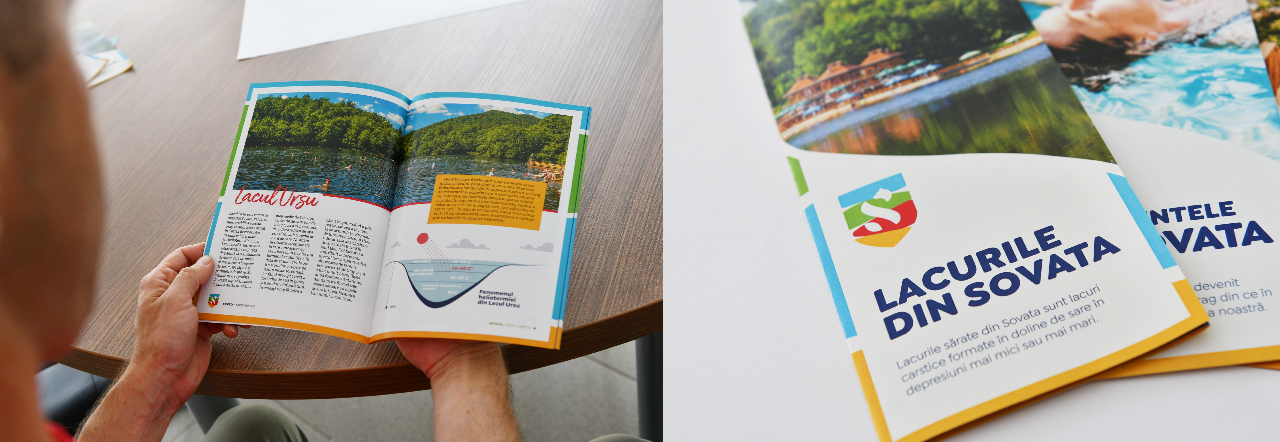
The logo’s colour scheme reflects the experience and the different services offered by the town: the colours used on the logo of the town (place brand) are blue and apple green, preserved from the coat of arms; the logo of the town hall is designed in the official, formal blue; while the colour play on the logo used for tourism reflects the diversity of the town.

The new identity is recognisable, coherent, easy to use on digital platforms and as diverse as the town itself.