Târgu Mureș
City Hall rebrand

A unifying institution without a unified brand

The Municipality of Târgu Mureș, one of the largest cities in Romania, oversees the work of more than 20 subordinate institutions and employs over 1,000 people. The local government plays a vital role in connecting these institutions to the citizens of the city.

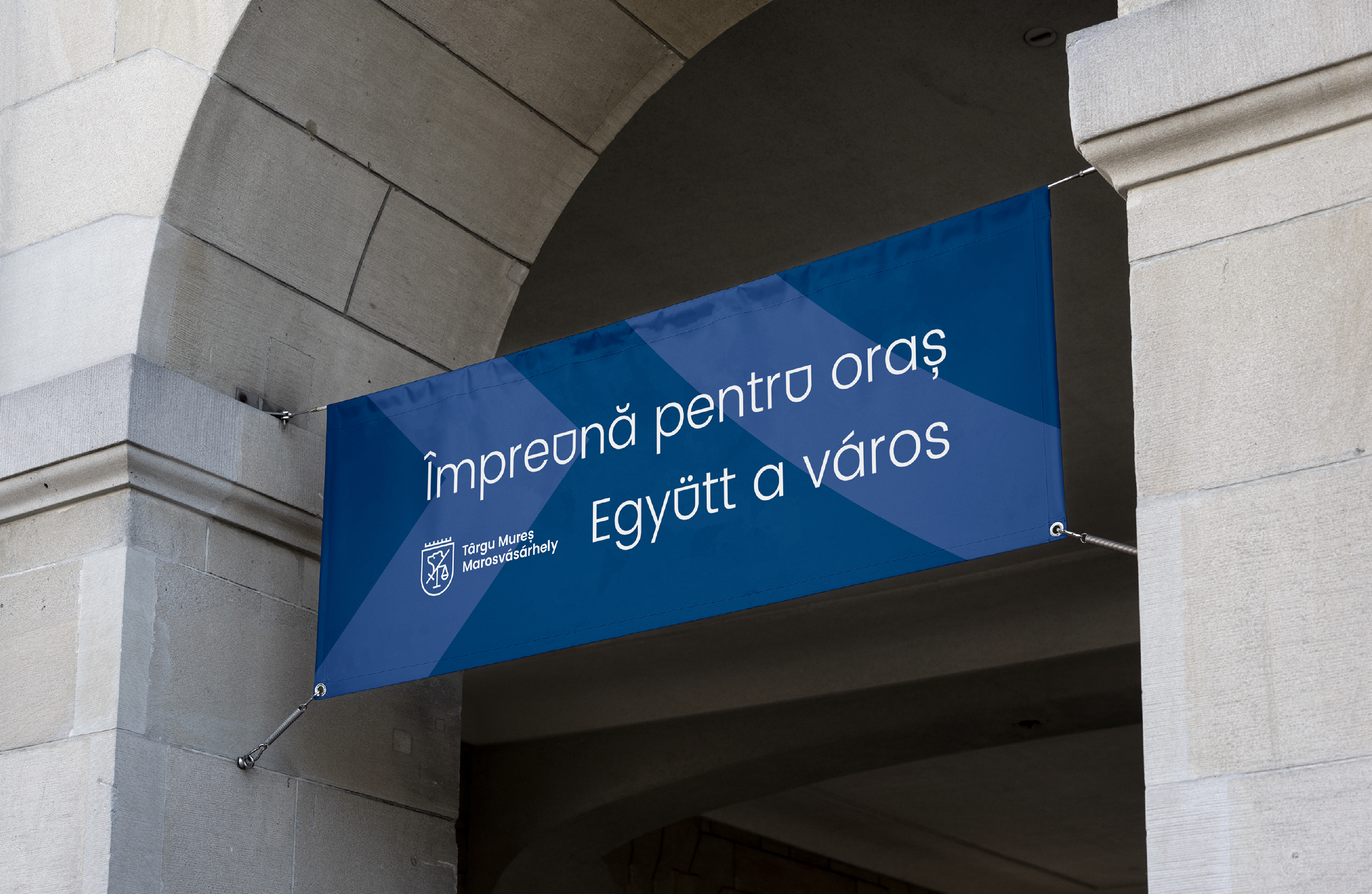
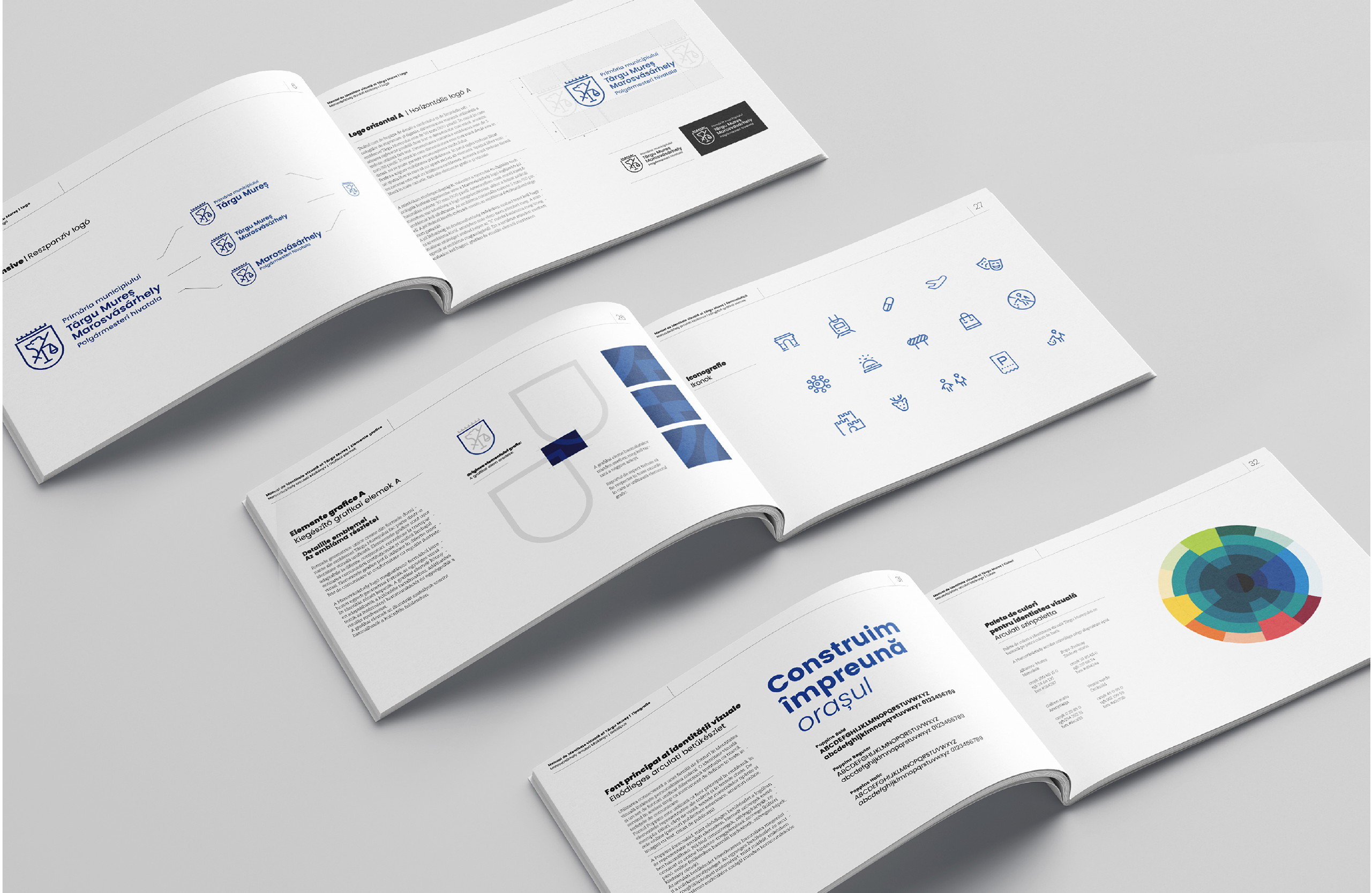
In the past, the local government did not have a comprehensive brand strategy, and communication efforts remained limited, too. It is the main goal of the new municipal leadership, our client, to make decisions together with the society and become as transparent as possible while maintaining continuous dialogue with its citizens.

Red Dot Award Winner 2022, Transform Awards Europe Silver Award, WBDS Commended Award,  and Best Brands Awards Award of Excellence.

SERVICES PROVIDED

Brand Strategy
Visual Identity
Identity Guidelines
Digital Design
Motion design
Brand Support

Rebrand introduction video:

The Municipality of Târgu Mureș used the city’s coat of arms as its logo, which was often unfit for present-day communications requirements, and subsidiaries all adopted their own versions of it due to the lack of a predefined style guide.

U for Unity

Drawing on Târgu Mureș’ rich architecture and artistic background, we carried out primary research with local architects, art historians and artists to gather as much information for the design process as possible. Based on the coat of arms, dating back to 1616, we devised the following key elements for the logo and the new design system that bears the name “The city, together”:

Târgu Mureș’ coat of arms and its signature blue color. Previously used as the city’s logo, our goal was to highlight its defining symbols and create a modern, simplified logo using these design elements.

The patterns and shape of the city’s emblematic Zsolnay-style roof tiles. Instead of keeping the pointy shield of the original coat of arms, our design system introduced a milder yet powerful shape that is based on Târgu Mureș’ typical roof tiles.

The arches of City Hall’s entrance and other important buildings in the city. Most of Târgu Mureș’ landmark buildings, most notably the entrance to City Hall itself, feature U-shaped arches, very similar to the roof-tile shapes and the shield in the coat of arms.

The design system uses a free font on purpose, to limit the budgetary burden on the municipality and its subordinate institutions.

Poppins is a monolinear typeface that is a great match with the logo and secondary elements, sports a wide range of weights, and supports the languages used by the municipality: Romanian, Hungarian, German, Romani.

A second design challenge was also caused by Târgu Mureș’ bi- and multilingualism, as the city has about the same number of Romanians and Hungarians, among other minorities. The municipality communicates bilingually, and, therefore — in most cases — the texts are duplicated.

In the end, the design process went much further than the original brief, as we completed the new visual identity based on the brand strategy and brand essence and handed over the identity manual and a multitude of assets and templates — all of which are flexible, easily customizable, and universally applicable.

Our design studio is proud to have contributed to the most extensive visual identity redesign project among Romanian local governments.

Before & After

Project Team:

Creative Direction/Strategy: Porcsalmi Balázs
Graphic Design: Domokos Zsolt
Graphic Design: Szabó Zsolt
Motion Design: Curta Andrei
Contributing Typographer: Vatány Szabolcs