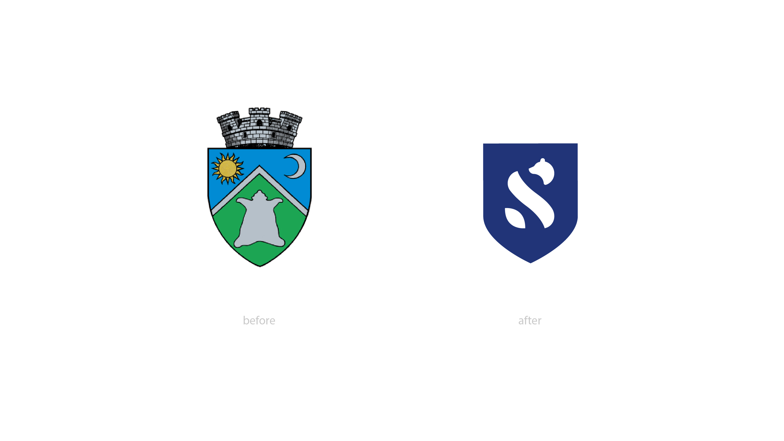
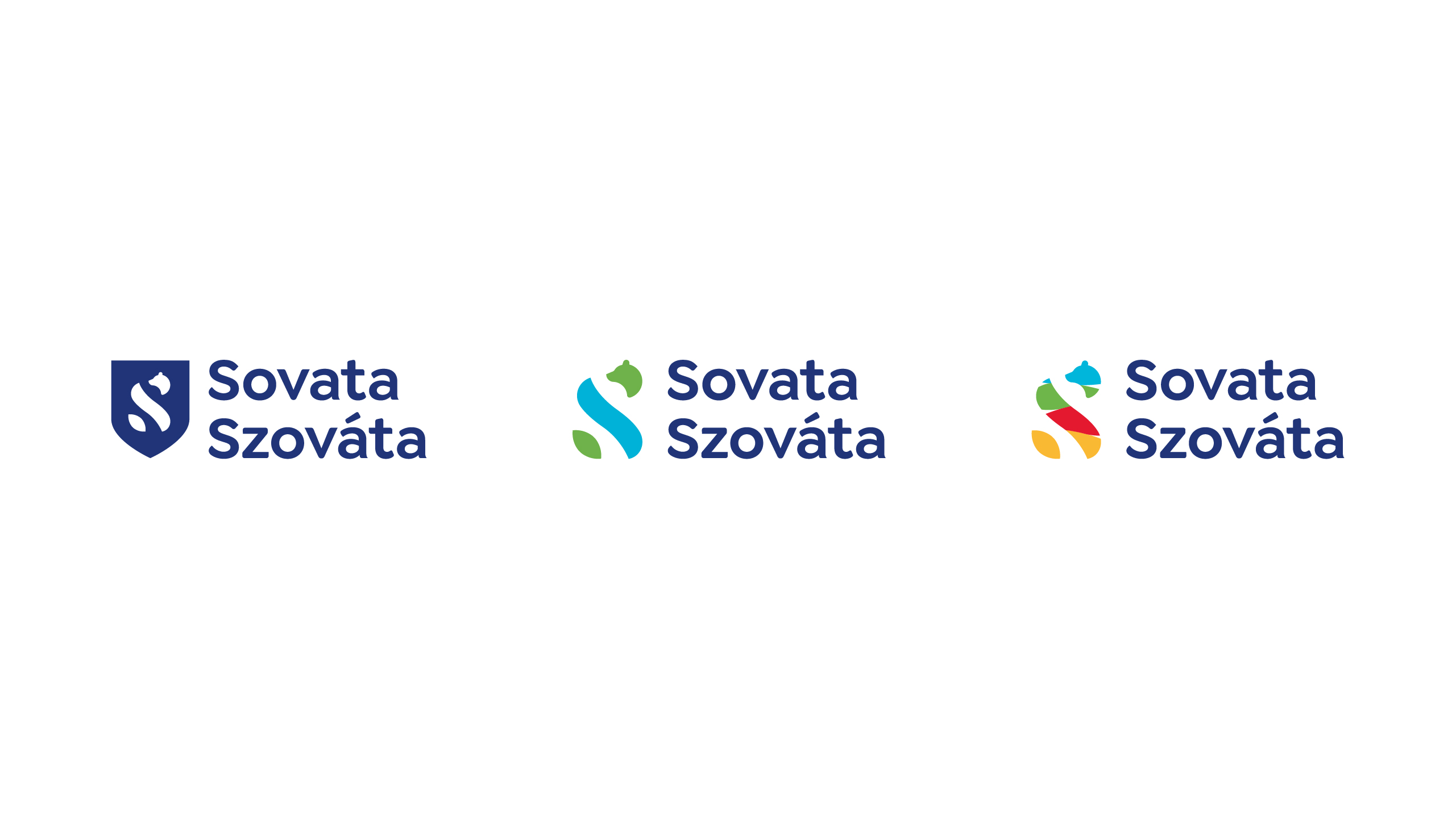
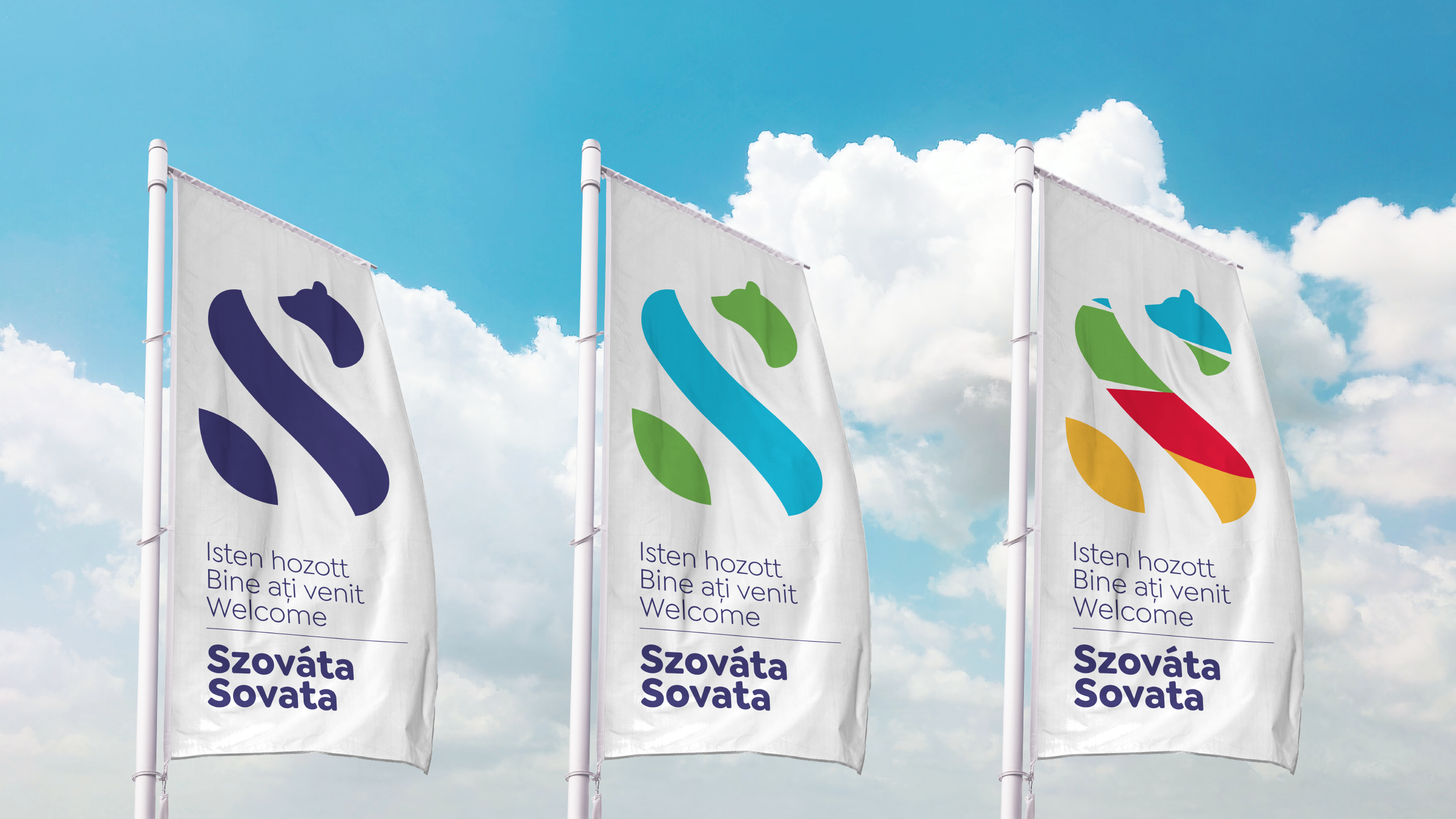
There is only one Sovata!
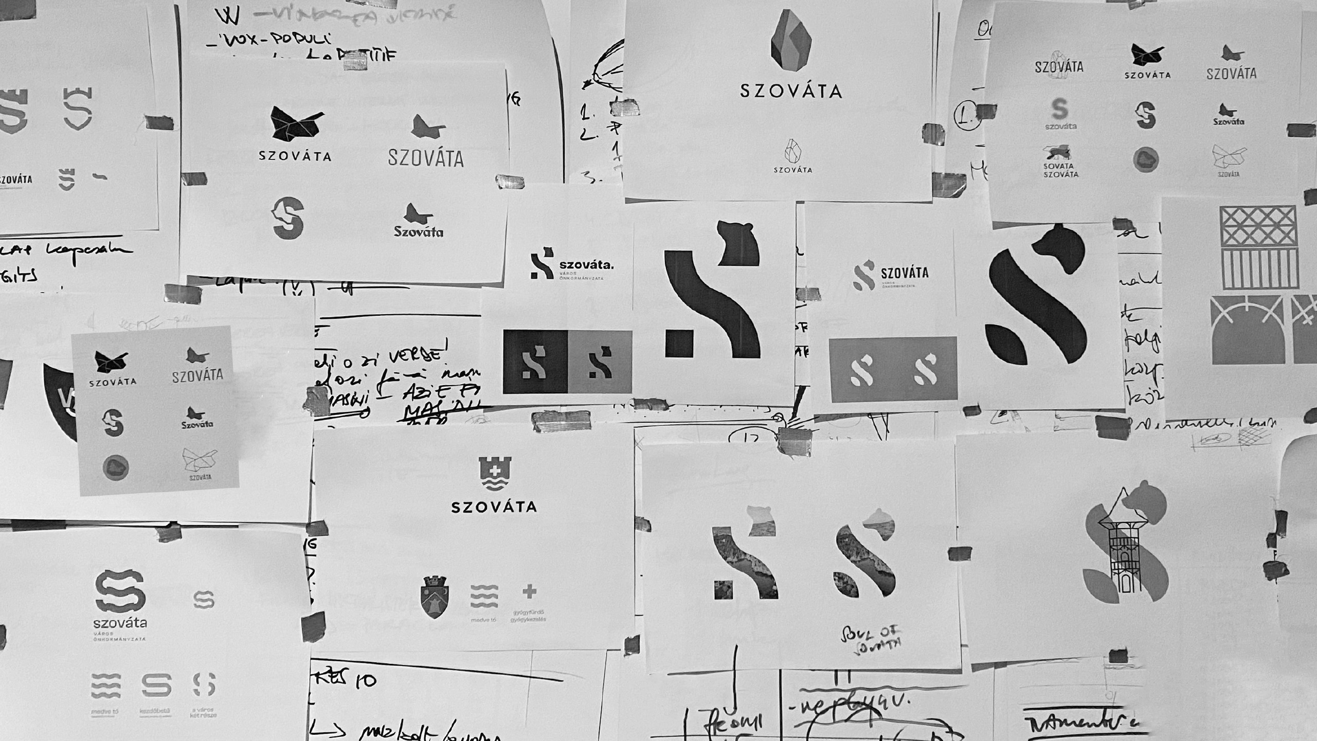
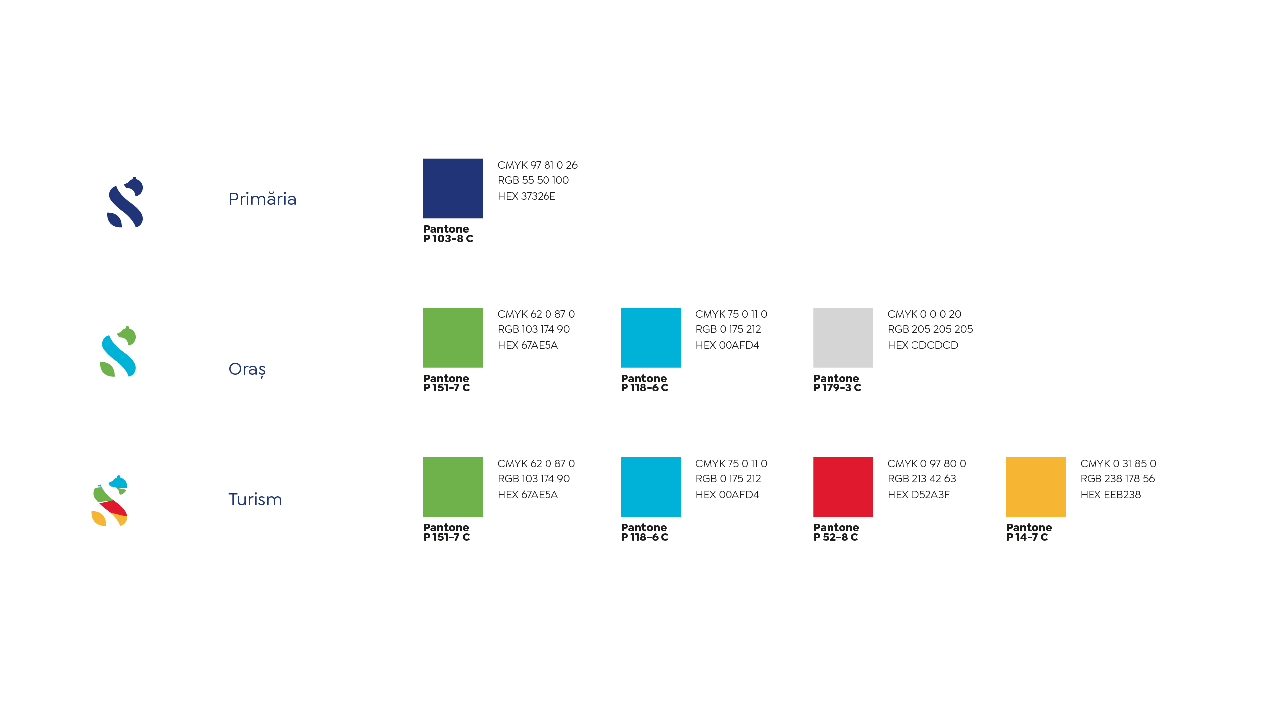
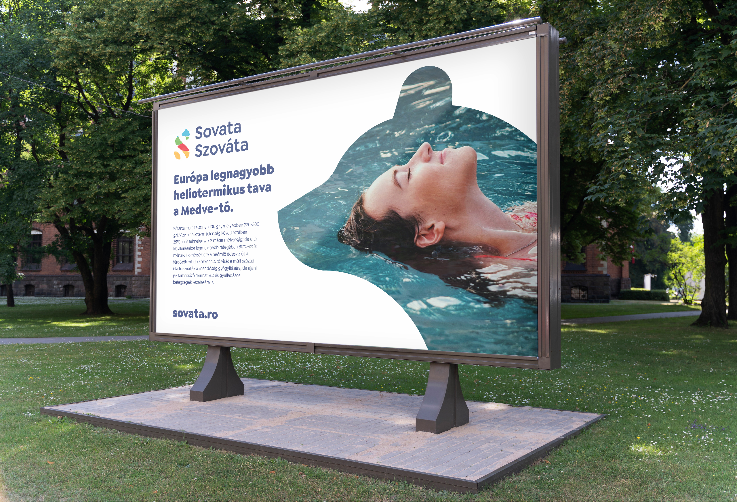
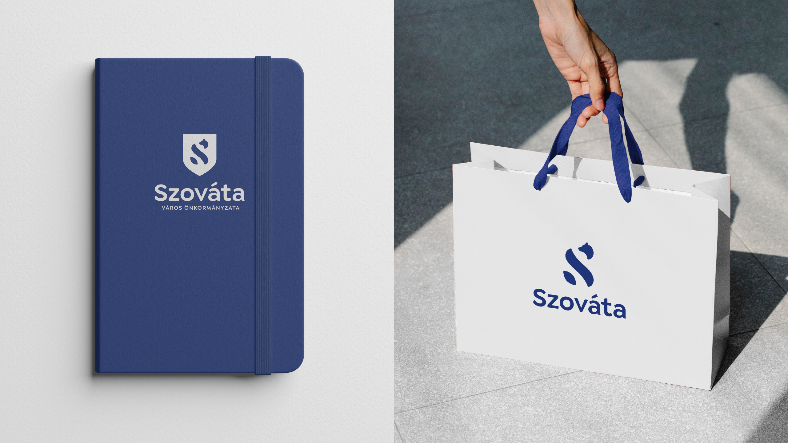
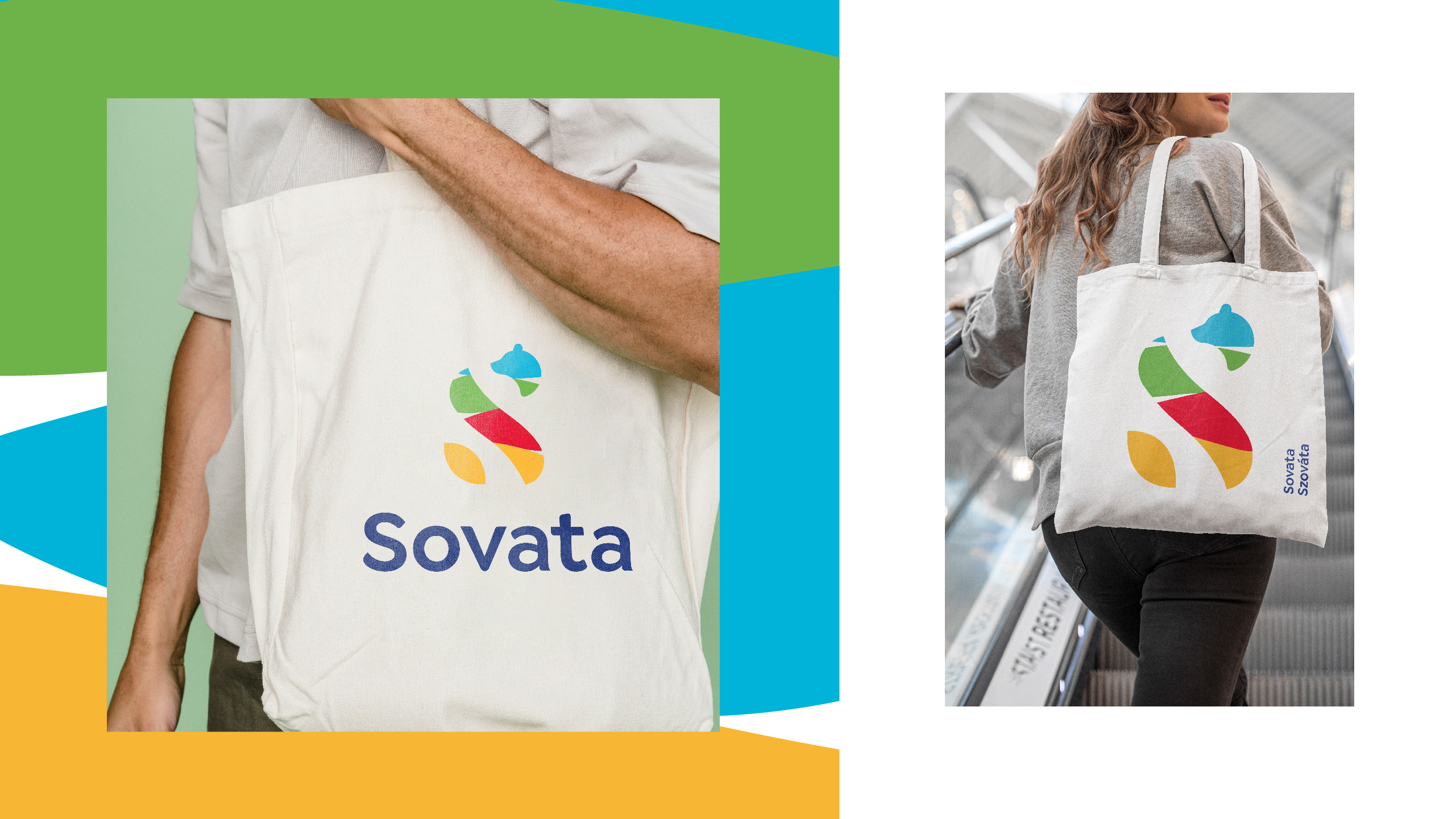
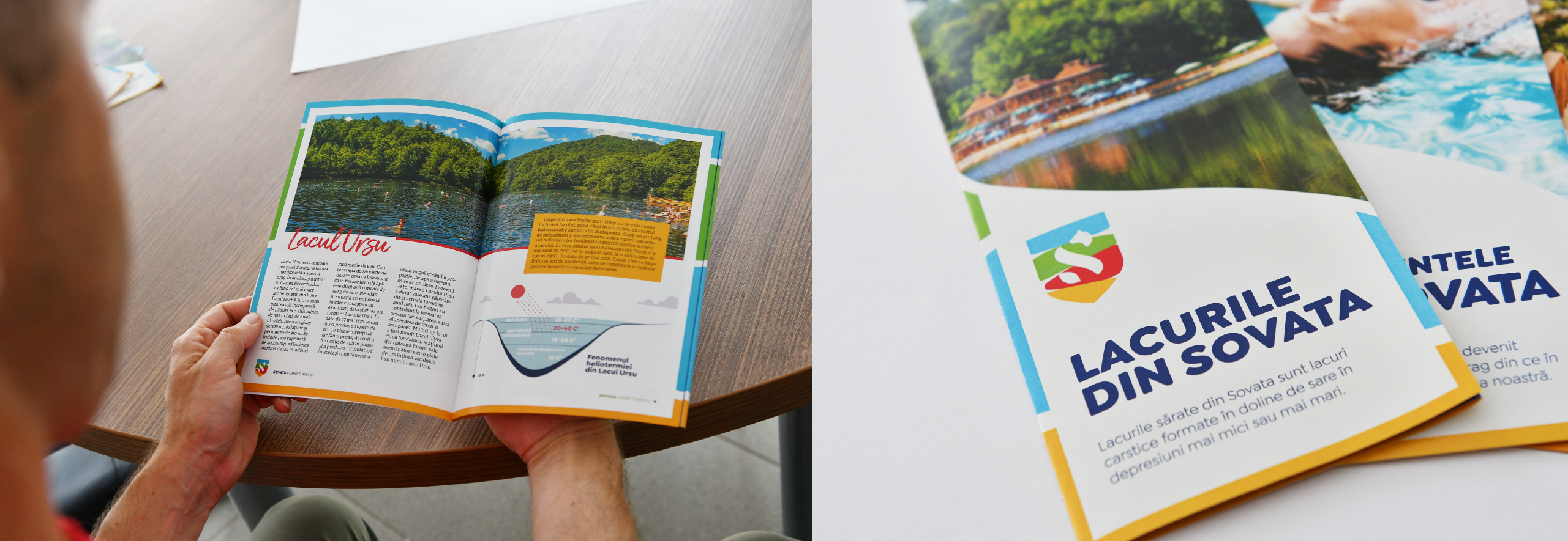
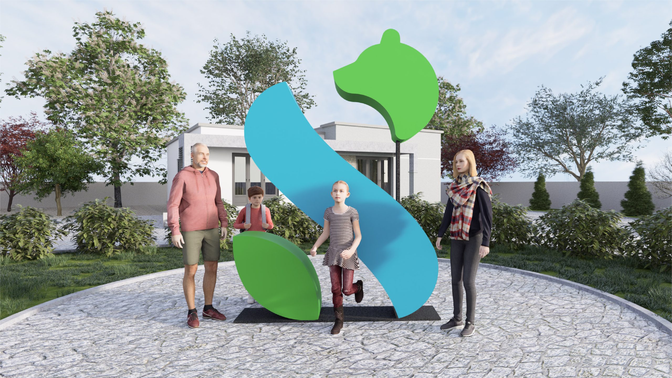
Sovata is the most famous resort town in Transylvania, a strong urban and tourist brand. It is a natural wonder, a home to many experiences. The town, the town hall and its tourism institutions needed a coherent, but flexible and modern identity that would reflect all this diversity and uniqueness. A particular challenge was that both Sovata as a town and Sovata as a resort have a strong character, but the two are often perceived as separate entities rather than as part of a whole.